Two lawyers, two doctors, and an army officer walk into a Zoom meeting and make Bright the best digital social community in the world. The team’s education and diversity of experience have given us the tools to confront some of the toughest tech and social problems.

We want to bring you another update about the development of the app, and it has been exciting to watch the process unfold. A few of us from Bright had the opportunity to go to Edinburgh to visit with part of the Bad Dinosaur development team and walk through some of our ideas in person, which was a welcome change from only being able to speak over Zoom.
It absolutely reaffirmed our belief -- and a central premise behind Bright -- that you can forge genuine connections online if the conditions are right.
It was, of course, a first meeting and a new experience for everyone -- placing actual, live faces to the people we see in a Zoom frame on a laptop. At the same time, it was a lot like meeting up with old friends, especially given the amount of time we spend talking to each other every day. So many of us have forged friendships and meaningful relationships over video calls these last 18 months, being together in the same space was exciting, but still had a deep sense of familiarity. It absolutely reaffirmed our belief -- and a central premise behind Bright -- that you can forge genuine connections online if the conditions are right.
Join the Waitlist
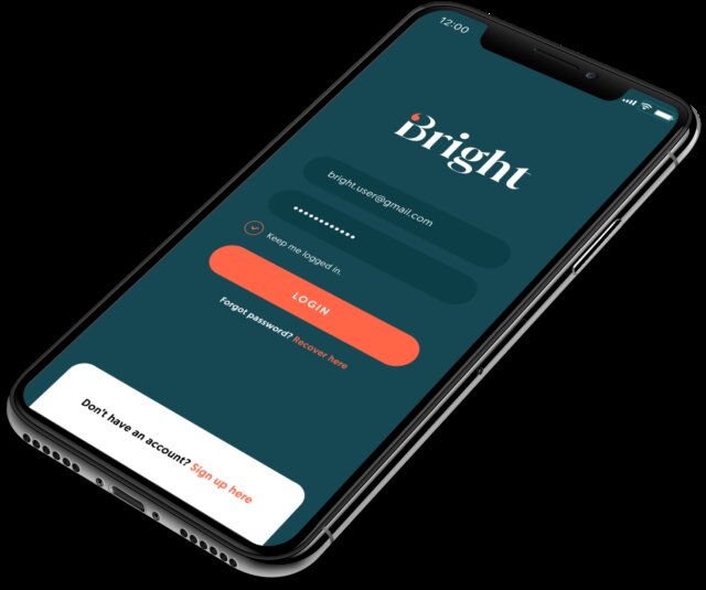
That's one reason why we have put so much effort into the design of the user interface (UI) components of Bright. It’s not enough that the app provides good content, connection, and engaging experiences -- it has to look like, feel like, and be a good experience itself. We’ve spent hundreds of hours honing that UI and will continue to do so as we move through the build itself.
Why is UI so important? It’s not something you might list first when you talk about things you like about an app, but it is literally the first thing you notice. When you open an app and engage with it, every choice you make is a part of that UI, and the quality of the design directly affects the quality of your experience. More than this, the design creates the spaces that allow Members to interact with one another and find the content they like (or, sometimes, that they don’t!). The point is that thoughtful design and planning means better UI, which means better experiences and a happier community. It’s part of our Member-centred approach: everything we do comes back to the idea that Bright should be the best of the Internet for our Members.
Members will have more control of their data -- and an easier time exercising that control -- than on any other social network
It’s not all design, though. We’ve made a lot of progress in designing the data architecture for the app. That’s important for a lot of reasons -- it means that the app will run smoothly, your interactions will be consistent, and the chances of a serious glitch decrease. It’s also important because it helps protect everyone’s privacy and control over their information. Members will have more control of their data -- and an easier time exercising that control -- than on any other social network. That means that Members decide how much to share, how much to keep private, and who gets to see what they post.UI and data architecture, then, are two of the unseen but meaningful factors that shape what it’s like to use an app. One is all about what you see and what you feel, the other is all about what you don’t see but what is nevertheless extremely important. When both are done the right way, you have the chance to create something truly extraordinary -- that’s exactly what we hope you’ll think about Bright.
We're coming through this part of the process more energised and confident in what lies ahead than ever before. Our team leaves every development meeting with fresh, exciting ideas that we immediately work to incorporate into the product pipeline for Bright, even as we're honing the beta version and keeping to our schedule. The momentum and the excitement are palpable, and we can't wait to share what we're building with you and then build it together with you.
Join the Conversation
Join the waitlist to share your thoughts and join the conversation.
The Bright Team
Two lawyers, two doctors, and an army officer walk into a Zoom meeting and make Bright the best digital social community in the world. The team’s education and diversity of experience have given us the tools to confront some of the toughest tech and social problems.
.png)