Two lawyers, two doctors, and an army officer walk into a Zoom meeting and make Bright the best digital social community in the world. The team’s education and diversity of experience have given us the tools to confront some of the toughest tech and social problems.
Hello from the Bright team! We’re happy to bring you this update on what we’ve been doing for the past few months and where our process is taking us. It’s been a busy summer and early fall, but we’re looking forward to an even busier few months!
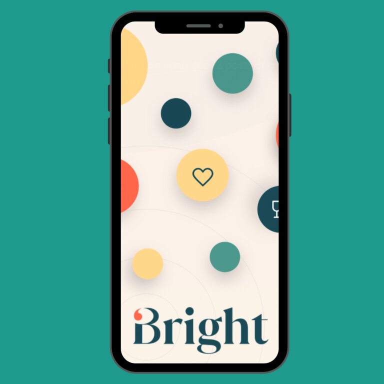
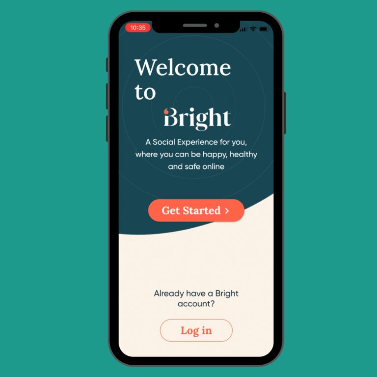
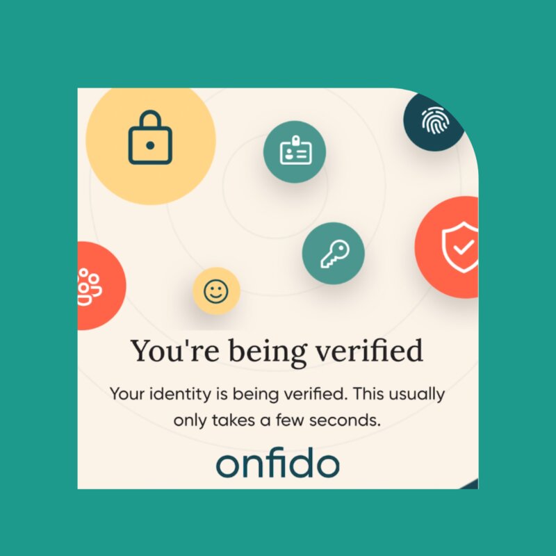
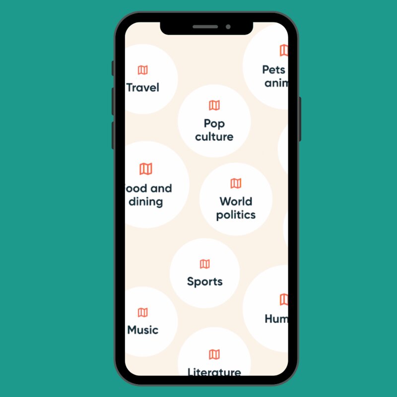
This week we’re absolutely thrilled to be able to share a major reveal with you: some screenshots of the app in-development! We spent a lot of time working with through every aspect of the app’s layout and feel, with an emphasis on making it a pleasure to look at and a pleasure to use. Shifting away from the emphasis on warm orange tones in the minimal viable product (MVP)/prototype, the app now has a combination of greens, tans, and oranges for a balance that we think is very easy on the eyes. Take a look for yourself:

Join the Waitlist
Posts now appear in their own frames set off from the background, making it easier and more intuitive to move between them as well as simpler to click through to get to the content you want. The frames now have rounded corners, which, counterintuitively, make them much sharper in relief against the background -- apparently Jony Ive was onto something.
And what about using the app? Making a post is simpler -- and more in your control -- than ever. One tap to open a draft, one tap to select what type of post you’re making, and your default privacy and sharing settings are already in place. Add photos, links, whatever you want, and you’re set.
Do those steps sound familiar? It should - we’ve designed posting so that it follows the method most of us have learned to use on social media. It’s on the back-end where the real differences in the process come into play. Your posts aren’t shared beyond the networks you select, the data you create isn’t bundled and sold, and the posts from others that you see aren’t designed to drive you to buy something. Instead, you post what you want and we show you what you like. Simple, and the way it always should have been.
We’re biased, of course, but we absolutely love these designs and the layout. It’s an inviting and inclusive design that’s built with your needs and wants in mind. In fact, the design is just the visible manifestation of the Bright philosophy: Bright is your network, your community, and so every aspect of it should be about making your experience better. We’re working on a slew of features and add-ons which we will share with you in our next status update, but for now, we couldn’t be more excited to show you the progress we’ve made.

So tell us what you think, share your feedback, and reach out to us. And don’t forget to tell your friends and family to join the waitlist so that they can be a part of what we’re building too. The more people who join, the better and richer the experience will be. Until then, have a great week, and we can’t wait to see you on Bright!
Join the Conversation
Join the waitlist to share your thoughts and join the conversation.
The Bright Team
Two lawyers, two doctors, and an army officer walk into a Zoom meeting and make Bright the best digital social community in the world. The team’s education and diversity of experience have given us the tools to confront some of the toughest tech and social problems.


.png)